Linear Regression#
The lm() class makes it easy to work with regression models estimated via Ordinary-Least-Squares (OLS)
Core Methods and Attributes
Method |
Description |
|---|---|
Fit a model using |
|
Get a nicely formatted table containing |
|
Compute marginal predictions are arbitrary values of predictors |
|
Simulate new observations from the fitted model |
|
Make predictions given a new dataset |
Models always store the results of their last estimation as polars Dataframes in the following attributes:
Attribute |
Stores |
|---|---|
|
parameter estimates |
|
parameter estimates, errors, & inferential statistics |
|
model fit statistics |
|
ANOVA table (next tutorial) |
from pymer4.models import lm
from pymer4 import load_dataset
import seaborn as sns

data = load_dataset("advertising")
data.head()
| tv | radio | newspaper | sales |
|---|---|---|---|
| f64 | f64 | f64 | f64 |
| 230.1 | 37.8 | 69.2 | 22.1 |
| 44.5 | 39.3 | 45.1 | 10.4 |
| 17.2 | 45.9 | 69.3 | 9.3 |
| 151.5 | 41.3 | 58.5 | 18.5 |
| 180.8 | 10.8 | 58.4 | 12.9 |
Univariate regression#
Let’s fit a model to estimate the following relationship:
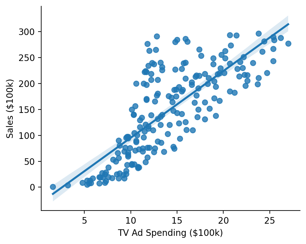
Show code cell source
grid = sns.lmplot(x="sales", y="tv", data=data, height=4, aspect=1.25)
grid.set_axis_labels("TV Ad Spending ($100k)", "Sales ($100k)")
sns.despine();
We initialize a model with a formula and a dataframe and call its .fit method.
Using summary=True will return a nicely-formatted table
model = lm("sales ~ tv", data=data)
model.fit(summary=True)
| Formula: lm(sales~tv) | ||||||||
| Number of observations: 200 Confidence intervals: parametric --------------------- R-squared: 0.6119 R-squared-adj: 0.6099 F(1, 198) = 312.145, p = <.001 Log-likelihood: -519 AIC: 1044 | BIC: 1053 Residual error: 3.259 |
||||||||
| Estimate | SE | CI-low | CI-high | T-stat | df | p | ||
|---|---|---|---|---|---|---|---|---|
| (Intercept) | 7.033 | 0.458 | 6.130 | 7.935 | 15.360 | 198 | <.001 | *** |
| tv | 0.048 | 0.003 | 0.042 | 0.053 | 17.668 | 198 | <.001 | *** |
| Signif. codes: 0 *** 0.001 ** 0.01 * 0.05 . 0.1 | ||||||||
All estimation results are always stored within the model and accessible as a dataframe
model.result_fit
| term | estimate | std_error | conf_low | conf_high | t_stat | df | p_value |
|---|---|---|---|---|---|---|---|
| str | f64 | f64 | f64 | f64 | f64 | i64 | f64 |
| "(Intercept)" | 7.032594 | 0.457843 | 6.129719 | 7.935468 | 15.360275 | 198 | 1.4063e-35 |
| "tv" | 0.047537 | 0.002691 | 0.042231 | 0.052843 | 17.667626 | 198 | 1.4674e-42 |
Result fit statistics (presented in the summary) are also stored within the model
model.result_fit_stats
| r_squared | adj_r_squared | sigma | statistic | p_value | df | logLik | AIC | BIC | deviance | df_residual | nobs |
|---|---|---|---|---|---|---|---|---|---|---|---|
| f64 | f64 | f64 | f64 | f64 | f64 | f64 | f64 | f64 | f64 | i64 | i64 |
| 0.611875 | 0.609915 | 3.258656 | 312.144994 | 1.4674e-42 | 1.0 | -519.045664 | 1044.091328 | 1053.98628 | 2102.530583 | 198 | 200 |
Models conventiently keep track of the data use for estimation and augment this dataframe with additional columns of observation level residuals, predictions, and additional fit statistics
model.data.head()
| tv | radio | newspaper | sales | fitted | resid | hat | sigma | cooksd | std_resid |
|---|---|---|---|---|---|---|---|---|---|
| f64 | f64 | f64 | f64 | f64 | f64 | f64 | f64 | f64 | f64 |
| 230.1 | 37.8 | 69.2 | 22.1 | 17.970775 | 4.129225 | 0.009703 | 3.253513 | 0.007943 | 1.273349 |
| 44.5 | 39.3 | 45.1 | 10.4 | 9.147974 | 1.252026 | 0.012169 | 3.265684 | 0.00092 | 0.386575 |
| 17.2 | 45.9 | 69.3 | 9.3 | 7.850224 | 1.449776 | 0.016494 | 3.265256 | 0.001688 | 0.448615 |
| 151.5 | 41.3 | 58.5 | 18.5 | 14.234395 | 4.265605 | 0.005014 | 3.252678 | 0.004339 | 1.312301 |
| 180.8 | 10.8 | 58.4 | 12.9 | 15.627218 | -2.727218 | 0.005777 | 3.261099 | 0.002047 | -0.839343 |
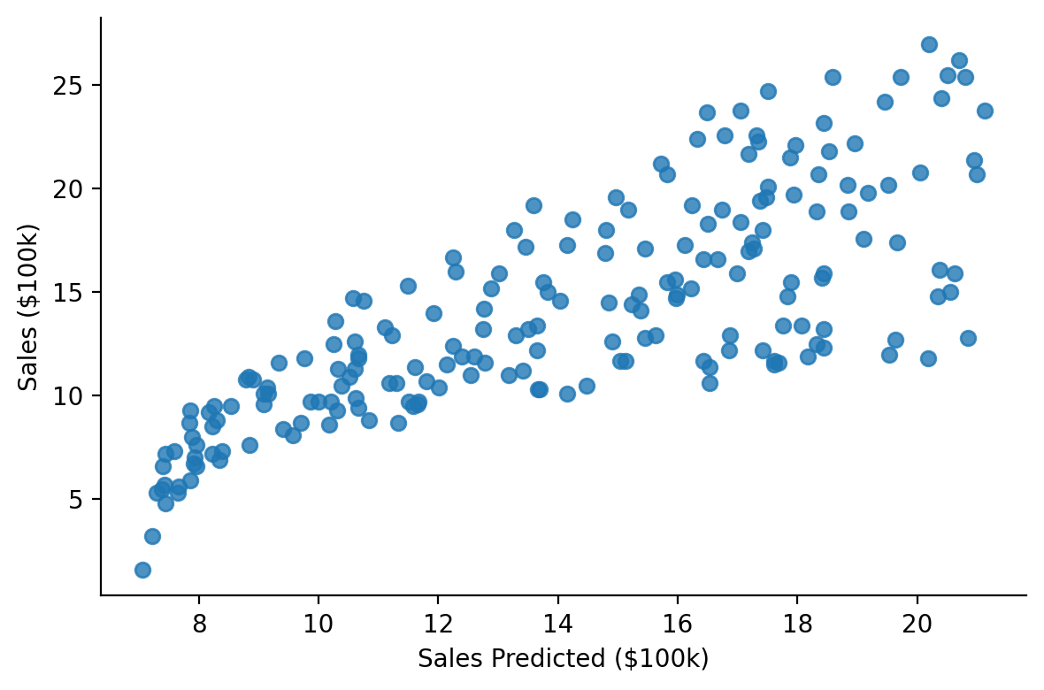
This makes it easy to visually inspect fits
Show code cell source
grid = sns.lmplot(x="fitted", y="sales", fit_reg=False, data=model.data, height=4, aspect=1.5)
grid.set_axis_labels("Sales Predicted ($100k)", "Sales ($100k)")
sns.despine();
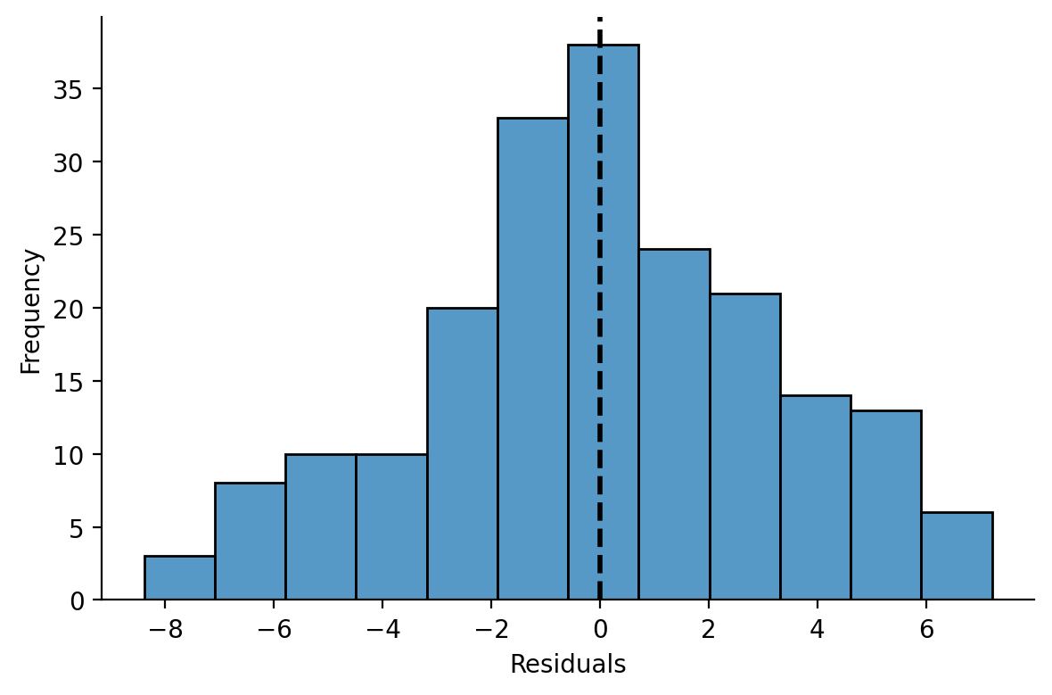
And model residuals
Show code cell source
grid = sns.displot(x="resid", data=model.data, height=4, aspect=1.5)
grid.set_axis_labels("Residuals", "Frequency")
grid.ax.axvline(0, color="k", linestyle="--", linewidth=2)
sns.despine();
Multiple Regression#
Let’s extend our model to estimate a multiple regression using another continous predictor
model = lm("sales ~ tv + radio", data=data)
model.fit(summary=True)
| Formula: lm(sales~tv+radio) | ||||||||
| Number of observations: 200 Confidence intervals: parametric --------------------- R-squared: 0.8972 R-squared-adj: 0.8962 F(2, 197) = 859.618, p = <.001 Log-likelihood: -386 AIC: 780 | BIC: 793 Residual error: 1.681 |
||||||||
| Estimate | SE | CI-low | CI-high | T-stat | df | p | ||
|---|---|---|---|---|---|---|---|---|
| (Intercept) | 2.921 | 0.294 | 2.340 | 3.502 | 9.919 | 197 | <.001 | *** |
| tv | 0.046 | 0.001 | 0.043 | 0.048 | 32.909 | 197 | <.001 | *** |
| radio | 0.188 | 0.008 | 0.172 | 0.204 | 23.382 | 197 | <.001 | *** |
| Signif. codes: 0 *** 0.001 ** 0.01 * 0.05 . 0.1 | ||||||||
Marginal Predictions#
When working with multiple predictors it can be helpful to visualize marginal estimates to interpret parameters. These are model predictions across values of one predictor while holding another fixed at 1 or more values.
We can use .empredict() to generate predictions for specific value combinations of our tv and radio. Let’s use it to explore the relationship between \(\text{Sales}\) and \(\text{TV Ad Spending}\) across different values of \(\text{Radio Ad Spending}\).
Using the "data" argument for tv tells the model to use all the observed values of that variable in the dataset, so we’re generating 3 predictions per data-point: radio = 0, radio = 20 and radio = 40
# Predict across the range of observed TV values at Radio values of 0, 20, and 40
marginal_predictions = model.empredict({"tv": "data", "radio": [0, 20, 40]})
We can then visualize these marginal slopes
Show code cell source
ax = sns.scatterplot(
    data=model.data,
    x="tv",
    y="sales",
    hue="radio",
    size="radio",
)

ax = sns.lineplot(
    x="tv", y="prediction", hue="radio", errorbar=None, data=marginal_predictions, ax=ax, legend=False
)
ax.set(xlabel='TV Ad Spending ($100k)', ylabel='Sales ($100k)');
sns.despine();
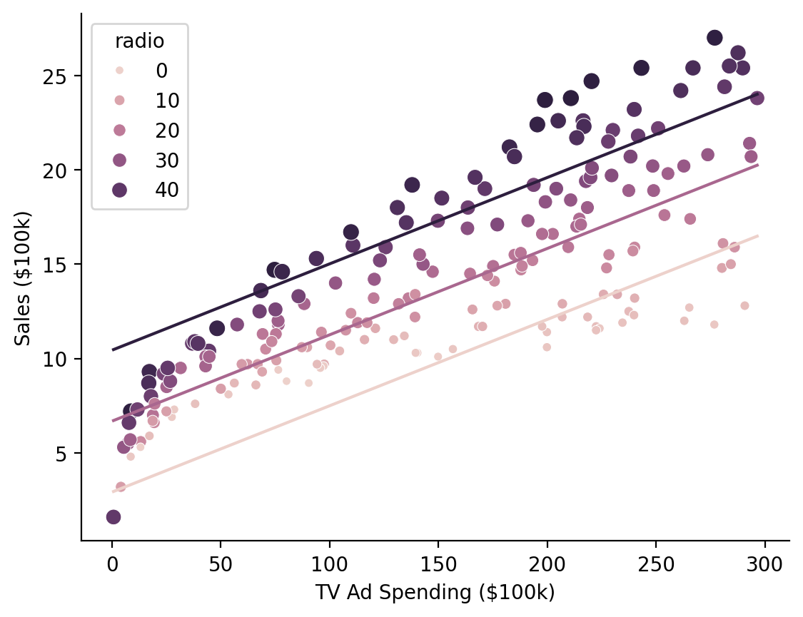
Hmm it looks like there might be an interaction between the variables that we’re missing…
Let’s extend our model to estimate a multiple regression with an interaction
with_interaction = lm("sales ~ tv * radio", data=data)
with_interaction.fit()
Model comparison#
Before interpreting the interaction estimate we can use model comparison to check whether this additional parameter results in a meaningful reduction in model-error
Note
compare() is powered by R’s anova() which uses F-tests (by default) to compare lm/glm models and likelihood-ratio tests to compare lmer/glmer models
from pymer4.models import compare

compare(model, with_interaction)
| Analysis of Deviance Table | ||||||||||
| Model 1: lm(sales~tv+radio) Model 2: lm(sales~tv*radio) |
||||||||||
| AIC | BIC | logLik | Res_Df | RSS | Df | Sum of Sq | F | Pr(>F) | ||
|---|---|---|---|---|---|---|---|---|---|---|
| 1.00 | 780.4 | 793.6 | −386.2 | 197.00 | 556.91 | |||||
| 2.00 | 550.3 | 566.8 | −270.1 | 196.00 | 174.48 | 1.00 | 382.43 | 429.59 | <.001 | *** |
| Signif. codes: 0 *** 0.001 ** 0.01 * 0.05 . 0.1 | ||||||||||
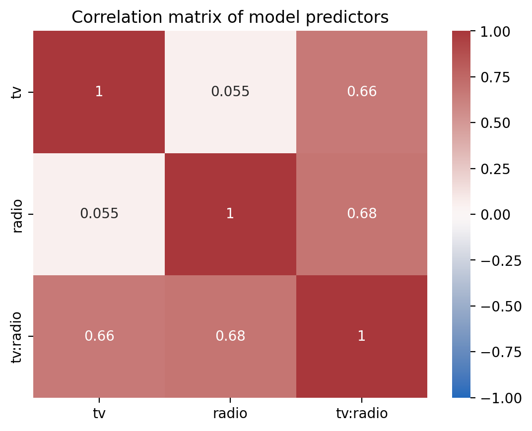
In models with multiple predictors and interactions, it’s good practice to center or zscore predictors to improve interpretability and reduce multicollinearity.
If we inspect our model’s design matrix we can see the strong correlations between predictors which can reduce the stability of our estimates
Show code cell source
ax = sns.heatmap(
    with_interaction.design_matrix.drop("(Intercept)").corr(),
    cmap="vlag",
    center=0,
    vmin=-1,
    vmax=1,
    annot=True,
    xticklabels=with_interaction.design_matrix.columns[1:],
    yticklabels=with_interaction.design_matrix.columns[1:],
)
ax.set_title("Correlation matrix of model predictors");
And we can inspect the variance inflation factor of each term and the increased uncertainty of our estimates. The effect of multi-collinearity would increase the width of our confidence intervals by a factor of about ~2-2.5x
with_interaction.vif()
| term | vif | ci_increase_factor |
|---|---|---|
| str | f64 | f64 |
| "tv" | 3.727848 | 1.930764 |
| "radio" | 3.907651 | 1.976778 |
| "tv:radio" | 6.93786 | 2.633982 |
Show code cell source
# Note this visualization requires the altair package
# which is not installed by default

from altair import X, Y, Color, Scale

(
    with_interaction.vif()
    .plot.bar(
        y=Y("term").axis(title=("")),
        x=X("ci_increase_factor:Q", scale=Scale(domain=[.9, 2.7])).axis(
            title=("CI Increase by a Factor of"),
            format='~s',
            labelExpr="datum.label + 'x'"
        ),
        color=Color("vif:Q", scale=Scale(scheme="blues", domain=[1, 7])).title("VIF"),
    )
    .properties(height=100, width=400)
)
Transforming Predictors#
We could manually center our variable by creating new columns in our dataframe, but the .set_transforms() method can handle this for us!
Now our slopes for \(\beta_0\), \(\beta_1\), and \(\beta_2\) are interpretable as other terms held at their means
Note
You can used .unset_transforms() to undo any transformations and reset variables to their original values and .show_transforms() to see what/if any variables have been transformed
with_interaction.set_transforms({"tv": "center", "radio": "center"})
with_interaction.fit(summary=True)
| Formula: lm(sales~tv*radio) | ||||||||
| Number of observations: 200 Confidence intervals: parametric --------------------- R-squared: 0.9678 R-squared-adj: 0.9673 F(3, 196) = 1963.057, p = <.001 Log-likelihood: -270 AIC: 550 | BIC: 566 Residual error: 0.944 |
||||||||
| Estimate | SE | CI-low | CI-high | T-stat | df | p | ||
|---|---|---|---|---|---|---|---|---|
| (Intercept) | 13.947 | 0.067 | 13.815 | 14.079 | 208.737 | 196 | <.001 | *** |
| tv | 0.044 | 0.001 | 0.043 | 0.046 | 56.673 | 196 | <.001 | *** |
| radio | 0.189 | 0.005 | 0.180 | 0.198 | 41.806 | 196 | <.001 | *** |
| tv:radio | 0.001 | 0.000 | 0.001 | 0.001 | 20.727 | 196 | <.001 | *** |
| Signif. codes: 0 *** 0.001 ** 0.01 * 0.05 . 0.1 | ||||||||
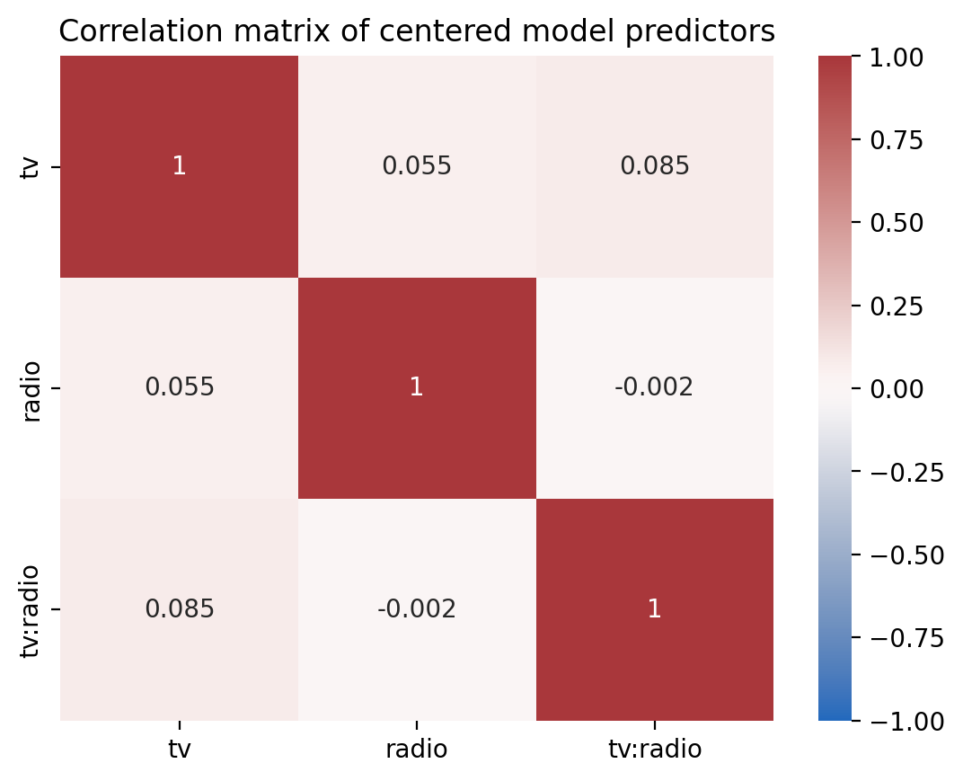
If we inspect the model’s data we can see that it made a backup of the original data columns and replaced values with mean-centered values. This make it easy to keep the same model formula and transform your variables as needed.
with_interaction.data.glimpse()
Rows: 200
Columns: 12
$ tv         <f64> 83.0575, -102.54249999999999, -129.8425, 4.45750000000001, 33.75750000000002, -138.3425, -89.54249999999999, -26.842499999999987, -138.4425, 52.75750000000002
$ radio      <f64> 14.536000000000001, 16.036, 22.636000000000003, 18.036, -12.463999999999995, 25.636000000000003, 9.536000000000001, -3.6639999999999944, -21.163999999999994, -20.663999999999994
$ newspaper  <f64> 69.2, 45.1, 69.3, 58.5, 58.4, 75.0, 23.5, 11.6, 1.0, 21.2
$ sales      <f64> 22.1, 10.4, 9.3, 18.5, 12.9, 7.2, 11.8, 13.2, 4.8, 10.6
$ fitted     <f64> 21.686389994098406, 10.634545599203337, 9.261214108544735, 17.63410792693333, 12.636919029730022, 8.789897605877398, 10.844280097486708, 12.171526528493542, 6.994718246057654, 11.206063903969167
$ resid      <f64> 0.41361000590159236, -0.23454559920333828, 0.03878589145526057, 0.8658920730666715, 0.2630809702699821, -1.5898976058774013, 0.9557199025132928, 1.0284734715064587, -2.1947182460576498, -0.6060639039691598
$ hat        <f64> 0.017369747127019233, 0.026436325056488314, 0.05425641179967553, 0.012417691773576945, 0.010414816585386587, 0.07087976521621937, 0.01492916315399197, 0.0057684281110012515, 0.0553012086193285, 0.021874324715662953
$ sigma      <f64> 0.9454595555094961, 0.9457784128013348, 0.9459272807185634, 0.9438714223516425, 0.9457419895847894, 0.938527958101928, 0.9434147988547761, 0.9430433221311386, 0.9320081079907699, 0.9449131143163492
$ cooksd     <f64> 0.0008642458743608146, 0.000430892510699134, 2.5626767031503242e-05, 0.002680796259339063, 0.00020671221250243943, 0.058285261875678805, 0.003946424590643695, 0.0017334470503899675, 0.08381996205406109, 0.002358436473146814
$ std_resid  <f64> 0.4422287472812875, -0.25193940977658613, 0.04227056711874558, 0.9234813152998302, 0.28029402654502694, -1.7481721440801545, 1.0205819867787846, 1.0932017507705427, -2.3932225922640367, -0.6494894322243936
$ tv_orig    <f64> 230.1, 44.5, 17.2, 151.5, 180.8, 8.7, 57.5, 120.2, 8.6, 199.8
$ radio_orig <f64> 37.8, 39.3, 45.9, 41.3, 10.8, 48.9, 32.8, 19.6, 2.1, 2.6
And we’ve reduce the multi-collinearity between our predictors
Show code cell source
ax = sns.heatmap(
    with_interaction.design_matrix.drop("(Intercept)").corr(),
    cmap="vlag",
    center=0,
    vmin=-1,
    vmax=1,
    annot=True,
    xticklabels=with_interaction.design_matrix.columns[1:],
    yticklabels=with_interaction.design_matrix.columns[1:],
)
ax.set_title("Correlation matrix of centered model predictors");
And no increase in the variance inflation factor of our predictors
with_interaction.vif()
| term | vif | ci_increase_factor |
|---|---|---|
| str | f64 | f64 |
| "tv" | 1.010291 | 1.005132 |
| "radio" | 1.003058 | 1.001528 |
| "tv:radio" | 1.007261 | 1.003624 |
Show code cell source
# Note this visualization requires the altair package
# which is not installed by default
(
    with_interaction.vif()
    .plot.bar(
        y=Y("term").axis(title=("")),
        x=X("ci_increase_factor:Q", scale=Scale(domain=[.9, 2.7])).axis(
            title=("CI Increase by a Factor of"),
            format='~s',
            labelExpr="datum.label + 'x'"
        ),
        color=Color("vif:Q", scale=Scale(scheme="blues", domain=[1, 7])).title("VIF"),
    )
    .properties(height=100, width=400)
)
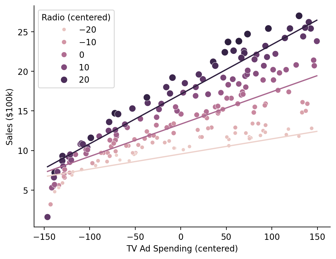
Visualizing our marginal predictions show that the model with an interaction fits the data better as the relationship between \(\text{Sales}\) and \(\text{TV Ad Spending}\) varies across levels of \(\text{Radio Ad Spending}\)
# Predict across the range of observed TV values at Radio values of 0, 20, and 40
marginal_predictions = model.empredict({"tv": "data", "radio": [0, 20, 40]})
Note
By default .empredict allows you to specify values on the original scale of the predictors, because this is often easier to think about with respect to your data. You can disable this by setting apply_transforms = False, in which case you should pass values on the transformed scale, e.g. mean-centered scale [0, 20, 40] - mean(radio)
Show code cell source
ax = sns.scatterplot(
    data=with_interaction.data,
    x="tv",
    y="sales",
    hue="radio",
    size="radio",
)

ax.legend(title='Radio (centered)')
ax = sns.lineplot(
    x="tv", y="prediction", hue="radio", errorbar=None, data=marginal_predictions, ax=ax, legend=False
)
ax.set(xlabel='TV Ad Spending (centered)', ylabel='Sales ($100k)');
sns.despine();
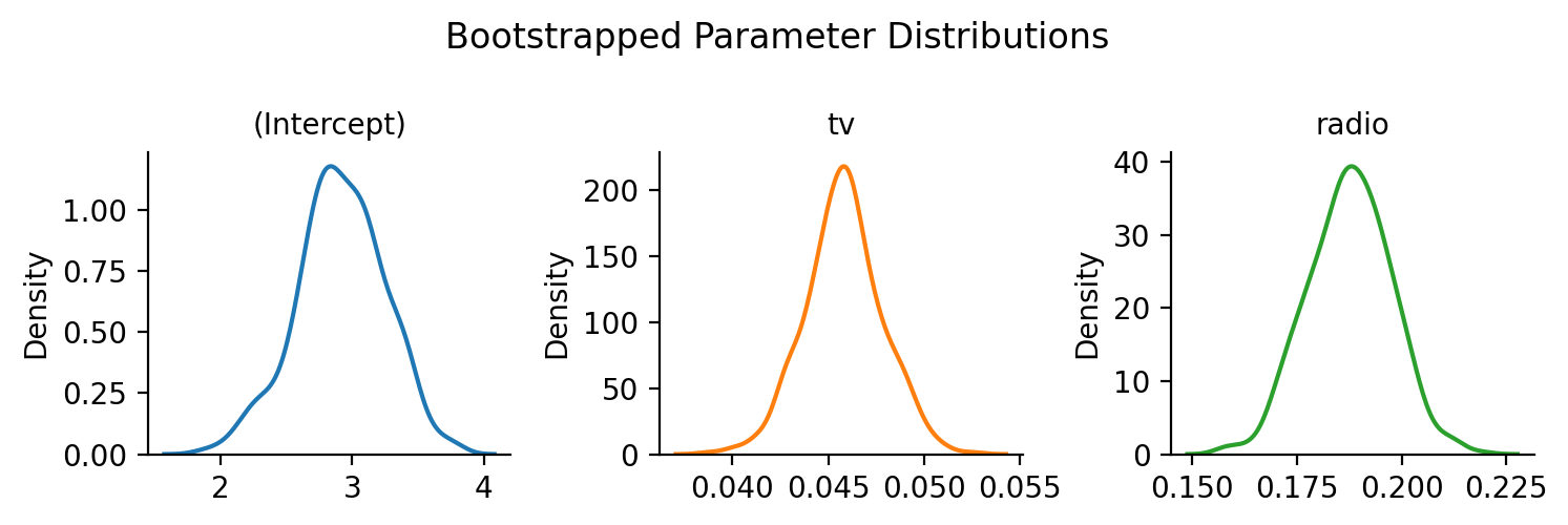
Bootstrapped Confidence Intervals#
It’s easy to get a variety of bootstrapped confidence intervals for any model using .fit(conf_method='boot')
model.fit(conf_method="boot", nboot=500, summary=True)
| Formula: lm(sales~tv+radio) | ||||||||
| Number of observations: 200 Confidence intervals: boot Bootstrap Iterations: 500 --------------------- R-squared: 0.8972 R-squared-adj: 0.8962 F(2, 197) = 859.618, p = <.001 Log-likelihood: -386 AIC: 780 | BIC: 793 Residual error: 1.681 |
||||||||
| Estimate | SE | CI-low | CI-high | T-stat | df | p | ||
|---|---|---|---|---|---|---|---|---|
| (Intercept) | 2.921 | 0.294 | 2.196 | 3.520 | 9.919 | 197 | <.001 | *** |
| tv | 0.046 | 0.001 | 0.042 | 0.050 | 32.909 | 197 | <.001 | *** |
| radio | 0.188 | 0.008 | 0.169 | 0.206 | 23.382 | 197 | <.001 | *** |
| Signif. codes: 0 *** 0.001 ** 0.01 * 0.05 . 0.1 | ||||||||
Individual bootstraps are stored in the .result_boots attribute of the model by default (you can control this with save_boots=False), which makes it easy to create visualizations:
Show code cell source
grid = sns.FacetGrid(data=model.result_boots.unpivot(), col='variable', hue='variable', sharex=False, sharey=False, height=2.5)
grid.map(sns.kdeplot, 'value')
grid.set_xlabels('')
grid.set_titles("{col_name}")
grid.figure.suptitle("Bootstrapped Parameter Distributions")
grid.figure.tight_layout();
Simulating from the model#
Simulating new datasets, i.e. new \(Sales\) from a model is just as easy
# Simulate 3 datasets
new_data = model.simulate(n=3)
new_data.head()
| sim_1 | sim_2 | sim_3 |
|---|---|---|
| f64 | f64 | f64 |
| 19.50217 | 21.243817 | 22.361988 |
| 12.654133 | 15.184968 | 15.532642 |
| 10.932024 | 15.004646 | 11.323162 |
| 20.299359 | 17.060741 | 16.959926 |
| 13.77793 | 9.381602 | 12.524089 |